Curtains are often underestimated in home décor. Many of us pick them at the last minute, treating them as a functional necessity rather than a design element. But here’s the truth: the curtains you choose can make or break a room’s aesthetic. The right colour combination can completely transform your interiors—making a space feel cozy, elegant, lively, or calm—while the wrong choice can throw everything off balance.
The good news? You don’t need to be an interior designer to get it right. With a little understanding of colour psychology, some smart pairing techniques, and a few insider tricks, you can choose curtain colours that elevate every corner of your home.
This ultimate guide will walk you through curtain colour combinations that work in any room, no matter the style or size of your home. We’ll explore timeless duos, trendy pairings, and room-specific ideas, plus give you practical advice on fabrics, textures, and layering. By the end, you’ll feel confident enough to pick curtains that don’t just cover your windows—but also reflect your style.
Why Curtain Colours Matter More Than You Think
Curtains are not just background décor. They are one of the first things people notice when they walk into a room because they cover large vertical surfaces. Their colours influence:
- Mood – Soft blues calm the mind, while mustard yellows energize the space.
- Perception of space – Light colours make a room look bigger; darker shades add intimacy.
- Cohesion – Curtains can bring together different décor elements, making the space feel intentional rather than thrown together.
- Functionality – The right tones can filter natural light beautifully or block it completely, depending on your needs.
Think of curtains as the bridge between function and style. Get them right, and you’ve got a room that feels “complete.”
How to Choose Curtain Colour Combinations: The Basics
Before we dive into specific colour pairings, it helps to know some guiding principles:
- Start with Your Walls
Your curtain colour should either complement or contrast with your wall shade. A safe rule: go two to three shades lighter or darker than your walls for a harmonious look. - Think About Room Size and Lighting
- Small rooms → Light curtains open up the space.
- Large rooms → Deeper tones add warmth and coziness.
- Sun-filled rooms → Richer shades prevent glare.
- Match with Accents
Look at your cushions, rugs, throws, or artwork. Curtains can pick up those accent colours to tie the whole design together. - Use the Colour Wheel
- Analogous combinations (colours next to each other) feel harmonious.
- Complementary combinations (opposites) create bold contrast.
- Triadic combinations (three evenly spaced colours) give a vibrant but balanced feel.
- Don’t Forget Fabric & Texture
A grey velvet curtain looks very different from a grey linen one. Always factor in the texture when deciding your colour combination.
Timeless Curtain Colour Combinations That Always Work

Here are classic duos that never go out of style:
1. White and Beige – Light, Airy, and Minimalist
Perfect for Scandinavian, modern, or minimal homes. Beige curtains with white sheers keep the room bright and fresh while adding just enough warmth. Works beautifully in small apartments where you want to maximize natural light.
2. Grey and Yellow – Modern with a Cheerful Twist
Grey is grounding, and yellow adds a pop of sunshine. This combination is chic yet uplifting, ideal for a living room or home office where you want energy without chaos. Try pale grey curtains with mustard yellow accents.
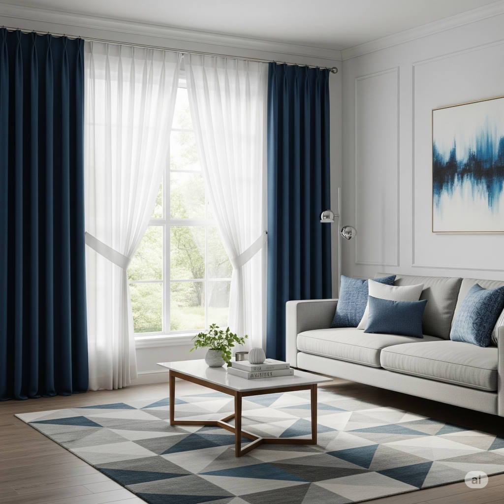
3. Navy Blue and White – Crisp and Timeless
A classic coastal-inspired look that works everywhere—from bedrooms to dining rooms. Navy adds depth and elegance, while white keeps things crisp and clean. This combo pairs well with wooden or rattan furniture.
4. Cream and Chocolate Brown – Warm and Inviting
For a cozy yet elegant feel, cream and brown are a safe bet. Perfect for family rooms, rustic spaces, or traditional homes. Layer cream sheers with deeper brown drapes to add dimension.
5. Charcoal and Blush Pink – Elegant and Balanced
Charcoal grey is sophisticated, while blush pink softens the mood. Great for bedrooms or modern living rooms. Add metallic gold accents through curtain rods or tiebacks for a glamorous finish.
Room-by-Room Curtain Colour Ideas
Every room in your home serves a different purpose, and curtain colours should reflect that. Let’s break it down:
Living Room Curtains
Your living room is the social hub, so your curtains should strike a balance between style and comfort.
- Neutral Elegance: Beige curtains with teal cushions and wall art.
- Bold Statement: Emerald green curtains against soft grey walls.
- Classic Luxury: Navy drapes layered over sheer whites.
Bedroom Curtains
Bedrooms are personal sanctuaries, so calming and cozy tones work best.
- Romantic Pastels: Blush pink and cream.
- Hotel-Inspired: Deep grey curtains with sheer whites.
- Relaxing Tones: Lavender curtains paired with soft whites.
Kitchen Curtains
Kitchens call for practical yet cheerful choices.
- Bright & Sunny: White and lemon yellow.
- Rustic Farmhouse: Red and white checks.
- Modern Freshness: Grey and mint green.
Dining Room Curtains
Dining spaces benefit from elegance and mood-setting tones.
- Classic Contrast: Burgundy and cream.
- Understated Luxury: Taupe and ivory.
- Modern Edge: Mustard yellow with charcoal grey.
Home Office Curtains
Curtains here should improve focus without distracting.
- Productivity Boost: Navy and beige.
- Creative Spark: Grey and teal.
- Minimal Vibe: White with light grey accents.
Curtain Colour Combinations by Style
Minimalist Homes
- White + Beige
- Soft Grey + White
Bohemian Vibes
- Terracotta + Cream
- Mustard + Olive Green
Glamorous Interiors
- Charcoal + Blush Pink
- Black + Gold
Coastal/Beachy Look
- Navy + White
- Aqua + Sand
Rustic Charm
- Olive Green + Tan
- Brown + Cream
Adding Depth with Patterns and Textures
Colour isn’t the only way to style curtains. Mixing patterns and textures can elevate even simple shades.
- Stripes → Navy and white stripes for nautical vibes.
- Florals → Pastel floral prints on beige backgrounds for vintage charm.
- Velvet → Deep jewel tones like emerald or sapphire with metallic accents for luxury.
- Sheers → White sheers under solid curtains for layered sophistication.
Practical Tips for Choosing Curtain Colours
- Order Fabric Swatches – Colours can look very different in store lighting compared to your home.
- Match with Flooring & Furniture – Dark wood floors? Try cream or light beige curtains. Pale tiles? Go with richer tones.
- Layer for Flexibility – Combine sheer curtains with blackout drapes for both style and functionality.
- Pick Long-Term Shades – Neutrals like beige, taupe, and grey are versatile if you plan to change furniture later.
- Pay Attention to Curtain Rods – Matte black rods suit modern looks, while brass or gold add a touch of glam.
Trending Curtain Colour Combinations for 2025
If you love staying ahead of trends, these pairings are making waves this year:
- Sage Green + Off-White → Calming, earthy, and modern.
- Terracotta + Beige → Warm Mediterranean vibes.
- Black + Soft Gold → Luxurious and dramatic.
- Denim Blue + Light Grey → Cozy yet contemporary.
- Blush Pink + Olive Green → Romantic with a natural edge.
Mistakes to Avoid When Picking Curtain Colours
- Clashing with Wall Colours → Always test combinations before buying.
- Too Many Competing Colours → Stick to 2–3 tones max in one room.
- Ignoring Function → Don’t choose sheer curtains for a bedroom if you need darkness.
- Forgetting Light Conditions → A colour that looks beautiful in sunlight might appear dull at night.
Final Thoughts
Curtains are more than window dressings—they’re an essential part of your home’s personality. The right curtain colour combination doesn’t just enhance aesthetics, it also affects how you feel in the space.
If you’re unsure, start with neutral bases (beige, white, grey) and layer in accent tones that reflect your taste. Remember, curtain colours don’t have to match everything in the room—they just need to harmonize.
From timeless duos like navy and white to trending combinations like sage and off-white, the possibilities are endless. Experiment, trust your instincts, and let your curtains be both functional and stylish.
With the ideas in this guide, you’re ready to transform any room with confidence—one curtain at a time.